
")
Harry Frankfurt the philosopher passed away, this past Sunday. He was 94. As the NYTimes obituary said, he was…
… a philosopher whose fresh ideas about the human will were overshadowed in the broader culture by his analysis of a kind of dishonesty that he found worse than lying — an analysis presented in a bluntly titled surprise best seller, “On Bullshit”…
I had been inspired by Frankfurt’s work to write a blog post (ChatGPT is a bulls*** artist) about how his ideas can help us understand what ChatGPT and other generative AI tools actually do. Over the past few months of working and playing (more play than work, honestly) I have come up with another metaphor.
I have come to realize that working with generative AI is like having, at your beck and call, a really smart, but (occasionally) drunk, intern.
(For some reason, I keep thinking that this idea of ChatGPT being a smart, drunk intern, is not original to me. I have a vague recollection of reading this somewhere on the web, but despite multiple searches, I can’t seem to locate the source.)
First these tools are intelligent. I do not want to get into a discussion on defining intelligence, but in the most basic sense of the word (of having the capacity to learn, adapt, understand / handle abstract concepts and solve problems), there is no doubt in my mind that these tools are intelligent.
Second, these technologies are conversational, in that they use language (a uniquely human capability), and can understand and respond to queries and prompts in a threaded manner, guided by context and the history of prior interactions. This combined with its expertise make it an ideal working partner, a smart intern as it were.
The true potential of this technology shines through when we regard it, not as a search engine that spits out the right answer, but rather as a partner, or a collaborator. Moreover, it is tireless. Never gets bored, even when asked to preform the most trivial of tasks. And it is almost puppy-like in its eagerness to help. They can, in pretty sophisticated ways, help you compare concepts, construct counterarguments, generate analogies, analyze data, and evaluate logic—in short help you think and get tasks done.
There you have it, a pretty smart intern.
Sadly, this intern sometimes hallucinates, and makes things up. Moreover, it is quite confident of the quality of its output. And as you can imagine, that can be a problem. That is where the “drunk” part comes in. (Incidentally, it appears that GPT can do a pretty decent imitation of a drunk person – given the right prompts of course. But that is not what I am talking about.)
Instead of speaking in the hypothetical, I would like to share three recent examples that show case the talents and pitfalls of using genAI. The powers it gives us if engaged correctly and the ways in which it can lead us astray. Each of these examples builds on my explorations with Code Interpreter (and GPT4). Though my explorations of alcohol content and wine quality was fun – I wanted to take it further, towards more relevant, and authentic questions. Below are three examples, of data analysis using Code Interpreter. The first is one that I did with some survey data, the other two were explorations with two of my colleagues, with very different kinds of data and analysis.

The first task I did was analyze the data from a survey that we had sent to all MLFTC faculty around the use of generative AI in education (a topic that, as you can imagine, has received a great deal of interest). I am part of a university-wide team that has been tasked with supporting our faculty in understanding and engaging with these tools for teaching and learning. As a first step we were interested in better understanding what our faculty were thinking about these new technologies—which led us to designing a short survey. In less than a week we had over 90 responses and, moreover, I had, in hand, an excel file, with all the data.
I used GPT4 and Code Interpreter to analyze the data, and create a summary analysis of both the quantitative AND qualitative data. What this means is that in essentially in 30 minutes I had a complete report, graphics and all that I could download, and share with my colleagues. The fun part of it was also that I could ask Code Interpreter to make make the graphics using ASU colors. It asked for the hex codes of the colors then just took care of it. In fact, after a quick review, I could share the report, as is, with our faculty.
All I can say is WOW! This is one smart intern.

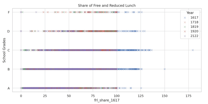
The second example comes from my friend and colleague, Margarita Pivovarova. Margarita works at the intersection of economics, quantitative methods to better understand educational policy. She brought a data set with her which included school letter grades for school in Arizona, was well as student demographics for years 2016-2022. She was interested in relating school grades to student demographics and creating some visualizations that would help people understand these relationships.
Our interaction with Code Interpreter was not a straight-forward as it has been with the survey data, partly, I am guessing, because of the complexity of the data, and partly for the kinds of analysis we were trying to make it do. It did great in giving us summary statistics of many of the variables and some basic correlations but when it started getting into regression modeling it began to choke up a bit. That said, at every instance, it would identify a problem (for instance that letter grades were not available for all schools) propose a solution (remove these data and conduct analysis on the remaining data), till it encountered another one. For instance, after cleaning up the data it realized that the letter grades were not numeric (something that was needed to run the analysis) so it changed them into numbers and continued the analysis – keeping us informed every step of the process. Finally it would give us an interpretation of what it had discovered through its analysis.
And what was important was that what we were engaged in was a conversation, going back and forth till we got it right. For instance, when it created scatter plots of the regression analysis, it forgot to include a color key, but fixed it, when asked to do so. Moreover, it could switch between regression models as well. For instance, it had, on its own, used an Ordinary Least Squares regression model and when Margarita asked it to try a Multinomial Logistic Regression (also known as a Multinomial Logit model) it switched approaches, but only after examining the data and seeing if this would work.
That said, though impressive, I was not entirely convinced by the work done by Code Interpreter. There were too many graphics generated that didn’t show anything. It got dates wrong and more. Overall, it was impressive at a surface level but I am not sure I would trust what it came up with. It was essentially a black box, at which we threw some data, and something popped out, accompanied by some legitimate sounding prose, and sometimes got things hilariously wrong. For instance, see this image below, where the years make no sense at all. I know, for sure, that we did not have data going back to 1617! Who knows where these numbers even came from?
Note added August 22, 2023: As you can see in the comments below Matt points out that I missed the boat here. 1617 is not the year 1617 but rather a short-cut for the duration 2016-2017, and so on. Makes perfect sense… and I feel kind of stupid for having missed that. I have not changed the post – since I don’t want to look smarter than I am 🙂
That said, I think the overall point, that Code Interpreter was pretty smart but it was a black box and one that I would be wary of trusting fully, still stands. But shout out to Matt for bringing that to may attention.
This was a pretty smart intern who showed up quite drunk!

The third example comes from my colleague Andrea Weinberg. who co-leads one of our learning futures collaboratives on Education, sustainability and global futures. As a part of this project they are looking at developing networks of networks, or organizations who are working in this space. So she brought with her a data-set very different from the ones above. Essentially, she had an excel spreadsheet with characteristics of 10 different networks that are somehow associated with sustainability education. What we wanted to was to identify synergies, unique characteristics of the networks and gaps that needed to be filled.
Once again we got into a conversation with Code Interpreter about the nature of the data, what we were interested in finding out and what would be the best strategies to do so. Once again Code interpreter (and GPT4) was extremely helpful in suggesting different approaches we could take to the task. This process was less frustrating than the previous one and there were no discernible or obvious errors. For instance, when we felt that the analysis it was doing was too fine-grained and at the level of words, it said:
Absolutely, I understand your need for a more conceptual analysis. The frequency analysis I’ve performed is a simple form of Natural Language Processing (NLP), which can be quite useful, but it doesn’t account for context, syntax, and semantics.
It then went on to offer us a list of possibilities, and recommended Topic Modeling as being the one worth pursuing. And as we dug deeper it kept providing new ways of looking across these networks to find those with similar focuses (as the first step towards collaboration). Within minutes we had a heat-map showing the topic distribution for each network. The color intensity in each cell represented the proportion of the corresponding topic in the network’s text data (darker colors indicate a higher proportion). It was clear from the heat-map, that each network had a dominant topic, represented by the darkest cell in each row. Moreover, the networks also had varying proportions of other topics, indicating that they cover multiple themes to different extents. And finally, it allowed us to download the heat-map as an excel spreadsheet! In fact, it went back and recreated the spreadsheet since it had forgotten to include the color gradient the first time around.
Finally it created a network graph showing the similarities between the networks based on their topic distributions. In this image, each node represented a network, and an edge between two nodes indicated that the networks had a high degree of topic similarity. The layout of the graph, it informed us, was “generated by a force-directed algorithm, which places more similar nodes closer together.”
According to Andrea, this was extremely helpful as a first pass, through the data. It provided insights that could then be followed up in greater detail by the research team. But this was a giant first step, which would have been difficult to pull without Code Interpreter and ChatGPT3.
Pretty smart. Not very drunk. Or maybe it was, but even then, we were not taking its results at face value.
In conclusion
These generative AI tools are amazing. They are conversational, smart, with a wide array of expertise and knowledge. They are fun to work with – not as a tool that will spit out the right answer, but as a “psychological other,” a partner or collaborator. But at the end of the day, caveat emptor. It is on us, to check and double check the outputs it provides rather than take them at face value.
But let me be clear what I am not saying. I am not saying that we should not use these tools. Not at all. I have developed a range of superpowers that I never had before (that I have written about elsewhere). For instance, I know that I am a better writer today, particularly on topics I know a decent amount about, because of these tools. In contrast, I can code with these tools, and have done so – but my lack of knowledge of programming languages means that I have no idea of what the AI is generating. What this means is that domain knowledge expertise is still important. And that I think is an important lesson for us as educators.
Note: The featured image above was created using Photoshop Beta’s Generative AI tool.


I’m guessing the dates in the free lunch chart were for school years. 1617 was not referencing the year 1617, but rather the school year 2016-2017. Note that all the other dates follow the same pattern: 1718 = 2017-2018, etc.
Thank you Matt. That is quite insightful – and I am kicking myself for not noticing that. I have added a note to the post – to both point that out and give you credit for catching my lapse.