
")
Note: The image above is an original design – showing “AI” embedded in the word “WEIRD”
Generative AI is weird… as I had written in my previous blog post, identifying some key characteristics I had described in a recent Keynote presentation. In the process of researching the post I stumbled across Janelle Shane’s website, quite appropriately titled AI Weirdness. The stuff she has been doing is just hilarious—not for nothing does her website bear the tagline A.I. Humorist. Seeing some of her experiments inspired me to start playing with DallE and seeing what it would come up with when asked to create educational illustration. The results are given below. In each case I offer the prompt that was given to Dall-E and the ensuing result(s), without commentary – because the images speak for themselves.
Long story short, professional illustrators are not going out of business anytime soon.
Prompt: Create an image of the periodic table of elements – where each cell as an image of the element and its name, and chemical symbol.
Prompt: Create an accurate scientific illustration of the ENT system of a human. Make it as detailed as possible – and place labels for each of the part.
Prompt: Create a representation of the 5 stages in the design thinking process. Make this representation using different colored sticky notes in a 16:9 ratio horizontal format.
Prompt: Create a representation of the TPACK framework, designed as if they are photographs of pages from a textbook on education. The diagrams include clear labels and intersections, making them suitable for educational purposes.
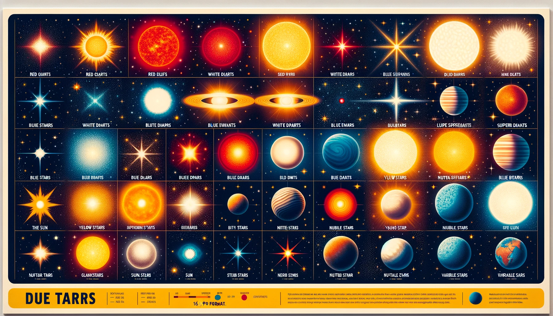
Prompt: There are many different kinds of stars in the galaxy, Create a nice educational poster which shows various kind of stars neatly arranged in a grid with clearly written names under each. Make this in 16:9 format.
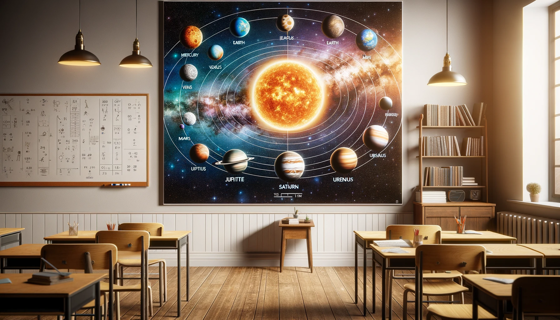
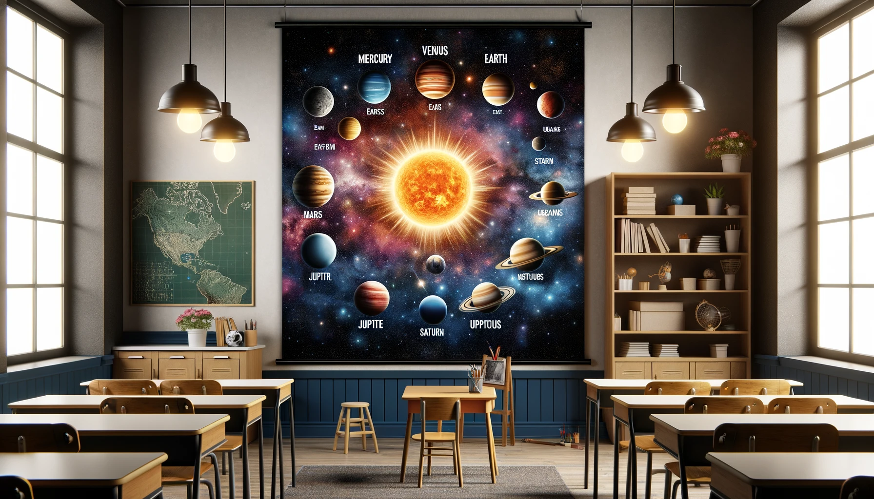
Prompt: Make me a lovely image of the solar system with the sun and all the planets correctly labelled – against a majestic backdrop of the milky way and other galaxies, as a poster hanging in a classroom.
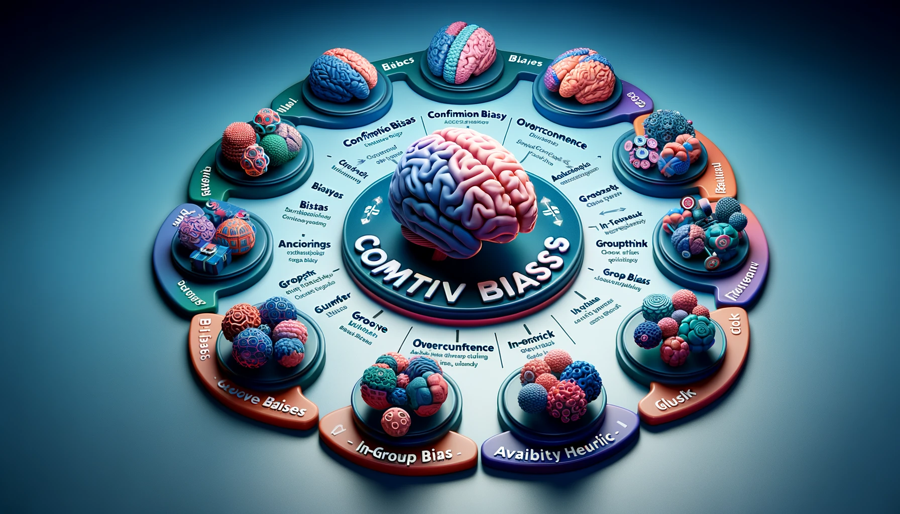
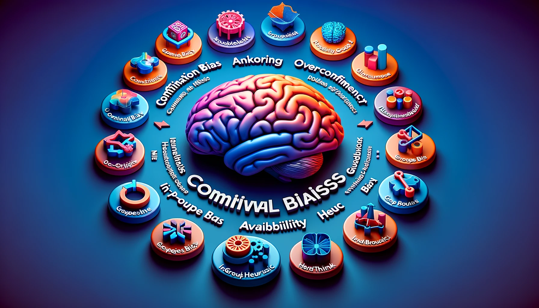
Prompt: Make a clear graphic that explains the various cognitive biases that humans fall prey to – distinguish between individual and group biases in your graphic. Provide interesting icons to represent each of the biases. Give it a photographic and 3-dimensional feel.
Note: This prompt was inspired by this amazing graphic created by John Manoogian III (via Wikipedia). As I said, professional illustrators don’t have much to worry about (yet).
0 Comments