
Many years ago I constructed an ambigram for the words “good” and “evil.” The idea came to me while waiting for a traffic light to turn green. The memory of it is so vivid in my mind that even today when I come to that particular intersection I remember that moment when the visual insight struck. Out of that came one of my most popular designs—one that has been replicated many times in books, websites, crafted in wood—sometimes with my permission, sometimes without.
The most recent use of the design (with permission) comes in Janet Smith Warfield’s blog post titled: Dancing with words- dancing with wisdom. Looking at this design Janet writes:

The black and white lines on the ambigram above have neither meaning nor emotional charge until our minds chop them up and give them both. When we see the word “good”, we feel safe and warm. When we see the word “evil”, we feel contracted, unsafe, and afraid. Yet none of the sensory data changes. All that changes is what our minds have done with it.
Irrespective of whether or not you agree with Janet’s interpretation, I think you have to accept that the design (good in one reading, and evil in another) is a kind of rorschach test, where the “meaning” of the design comes from an interaction of the perceptions of the viewer and the properties inherent in the design itself.
Bob Stake, a professor at the University of Illinois at Urbana-Champaign often spoke of the transactional theory of meaning by saying, “Beauty lies in the eye of the beholder, but is inherent in the flower.” The point I think he was trying to make was that meaning emerges not just from the object under observation or from the observer but rather from a transaction between the two. This is consistent with the idea that meaning making is a bi-directional, reciprocal and dialogic process that emerges from the interaction between the observed and the observer!
Whether you buy into this idea or not, enjoy the ambigram. As I said, this is maybe the best design I have created.
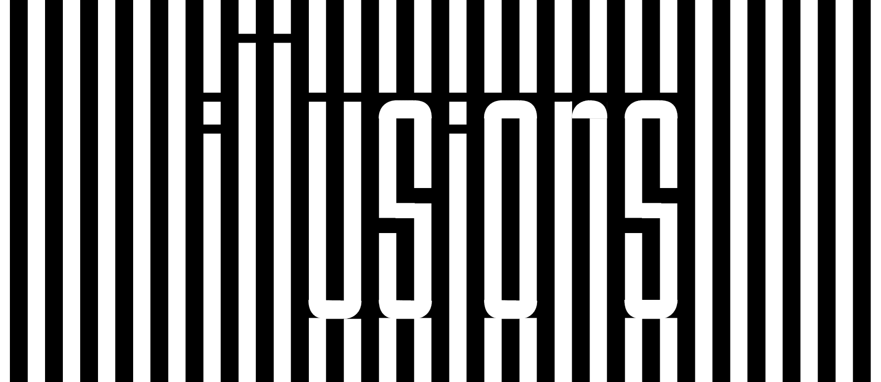
Gaurav, you remain my most loyal reader… and thanks for pointing out the Good (black)/Evil (white) contradiction, something I had NOT noticed. The nice thing about the design is that both good and evil have to exist for the design to work – which is cool.
BTW, I always had a problem with that Doyle/Holmes quote. What about considering the possible, before we get to the impossible/improbable? Also, what if more than one improbable solution remains? What then? And finally, can one really eliminated the impossible? Things can be impossible in infinite numbers of ways, I would think. Maybe it depends if there are a countably infinite number of impossible solutions.. in which case, technically, we could take care of the the infinity (though not really).
~ punya
One thing i noticed about it is that Good is in Black and Evil in White, which is somewhat contradictory. The other is of course possibility that if you remove the evil, good will remain which I am not so sure is true either.
Which reminds me…”When you have eliminated the impossible, whatever remains, however improbable, must be the truth”