
Sean Nash (of Nashworld) sent me a link to A Periodic Table of Visualization Methods of Management. This is a very cool looking representation developed by Ralph Lengler & Martin Eppler at the Institute of Corporate Communication at the University of Lugano, Switzerland. It attempts to define and compile “existing visualization methods in order to develop a systematic overview based on the logic, look, and use of the periodic table of elements.” [Quote from a paper the PDF of which you can download here.]
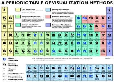
This is a pretty cool piece of software and a great resource. The image above does not do it justice since it does not capture the interactivity in the table – the fact that rolling over the cells pops out more information about each visualization technique.
That said, I find this representation fundamentally flawed.
Now this is not the only “periodic table” there is. We have all seen posters and images of similar attempts. Everything from vegetables to fruits and nuts; from rejected elements (which is actually quite funny) to condiments that go bad. There is a serious food theme going on here!
The problems I have with the visualization table applies to all of these tables too – however, these few examples I have listed in the previous paragraph have one redeeming feature. They are meant to be funny. This visualization table is a part of a site on visual-literacy, which makes their lapses all the more ironic.
In essence I have two key problems with this representation:
First, I have a fundamental issue with force-fitting these visualization techniques into a structure that was developed for something else altogether (in this case chemistry). I am not sure what the structure of the visualization techniques table should be – but it is clear to me that this periodic table version is not it. These tables attempt to shoe-horn a list of items into a “shape” that was supposed to show something else altogether.
The main point of the periodic table in chemistry is – surprise, surprise – that it is periodic. This periodicity is what gives us insight into chemical ideas such as valence, reactivity and deeper down into the actual structure of the atom. It provides a structure to the field of chemistry that it did not have before. The periodic system is a crucial “conceptual tool” that organizes the entire field of chemistry and helps chemists and students develop an integrated framework for further learning and exploration. There is a reason why there are just two columns in the first row, 8 in the next two rows, 16 in the three that follow (with a complication of two rows being placed outside the table entirely). This visual structure was not imposed by Mendeleev but rather is an emergent property based on the laws that rule the interactions between neutrons and protons in the nucleus and the electrons outside. The periodic table in chemistry allows us to see these patterns, these periodicities and make predictions about the properties of elements based on what we know about other elements.
Just check out Mendeleev’s predictions on wikipedia if you want to see just how powerful an organizational scheme the chemical periodic table is.
In contrast the visualization table has no deeper organizational scheme. It just co-opts a canonical one from chemistry, but what worked in that domain has no relevance in this one. Just ask yourself, if a cell were blank, could you, in any seriousness predict (based on its neighbors) what would go in it? If not, then why use this representation? Just because it works for chemistry? The funny thing is that even that may not be entirely true… which brings me to my second problem.
A close look at chemistry reveals that the standard table is not the only game in town. As it turns out that the relationship between the elements is multi-dimensional, context-sensitive and fexible which makes the periodic system a rich, complex and ill-structured domain—dependent on the interplay of a multitude of concepts and allowing for multiple representational formats. As a chemist said:
One of the fascinations of inorganic chemistry is the existence of a wide variety of relationships among the elements and their properties—relationships that show an encouraging degree of order, but a tantalizing variability and novelty. These qualities make the “family of elements” an apt metaphor: while members of a family have much in common, each member also has his [sic] own individual personality. The quality of relatedness among elements makes periodic tables possible. But the diversity of their interrelationships bars any one table from a monopoly on the advantages (Rich, 1963; p. xx).
Think about this for a minute – even chemists don’t think that this standard representation is the best one. In fact they have been coming up with alternative representations for years and years. Mazurs (1974) lists over 400 of them in his book, Graphical Representations of the Periodic System During One Hundred Years.
In fact my doctoral dissertation was about these different representations of the table (see Mishra & Yadav, 2006 for details). There is nothing special or unique about the standard version. For instance it is not the case that this is a “correct” representation and all the others are wrong. Not at all. All these representations are right in their own way – again more details can be found in Mishra & Yadav, 2006. Here are are couple of interesting representations from my collection (and a quick Google search revealed more and more and more…).


To conclude, this attempt to create a periodic table of visualizations is a failure by forcing it to be something it cannot be, AND turns out that the domain being co-opted is not necessarily bound to this canonical representation either. Double Fail.
Sean, the person who initiated this blog posting (rant?) in response to my reply to his original email said this best
I too cringe at the hijacking of shape and form for a totally unrelated purpose. Years back, someone gave me a “periodic table of fruits and nuts” poster. Wow. Much like this…it is beautifully executed. It contains a wealth of information. And it too… hasn’t a single periodic notion to it. (for if it did, it would certainly be of a different shape, eh?)


I know this is besides the point, but since you mentioned periodic tables… this is the most compelling rendition I have seen: http://periodictable.com/
Click on the element for more delights…
Here is a post I just logged about our periodic… conversations.
😉
http://nashworld.edublogs.org/2009/03/05/the-power-of-visualization/
Sean