
Gallup recently released a poll on student engagement – and the main finding is that “the longer students stay in school, the less engaged they become.” As the post says:
The Gallup Student Poll surveyed nearly 500,000 students in grades five through 12 from more than 1,700 public schools in 37 states in 2012. We found that nearly eight in 10 elementary students who participated in the poll are engaged with school. By middle school that falls to about six in 10 students. And by high school, only four in 10 students qualify as engaged.
See the graph below:

No doubt, this IS a real problem – as the author says a “monumental, collective national failure.”
There are of course many reasons for this significant drop in engagement. These range from “overzealous focus on standardized testing and curricula to our lack of experiential and project-based learning pathways for students — not to mention the lack of pathways for students who will not and do not want to go on to college.” John Tierney in the Atlantic includes a few more possibilities, including “an outdated and broken paradigm of assembly-line formal education,” inadequate resources, “a cultural failure to value teachers” and “student transition from chilhood to adolescence.”
I would agree with all of these but that is not the point of the blog post. As I was discussing this chart with my son I was struck by a subtle but important piece of subterfuge in the graph—a piece of visual trickery to make a point, but a piece of trickery none-the-less. To understand what I am talking about see the same graph, slightly modified, below:
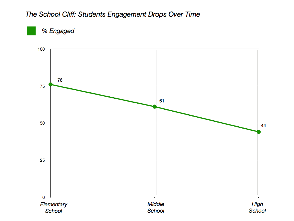
If you compare the two graphs side by side, you will see that though there is no change in the data being represented the two graphs provide a slightly different visual story. The first graph by truncating the y-axis makes the drop in student engagement across the years much more dramatic. Though the numbers show a drop from 76% to 44% = the visual tells a very different story. Visually the drop goes from close to 100% of the line to close to 0%. So though the numbers tell one story, the visual give us another! Which story, do you think, will people remember?
The modified second graph, provides a more complete picture. Approximately 25% of students don’t engage in elementary school, and that increases to around 55% in high school. In other words, the drop is from 76% to 44% – and the visual supports that answer.
Don’t get me wrong. I think that the fact that 25% of kids in elementary school are not engaged is a significant problem in and of itself. For it to balloon to 56% by high-school is terrible. As the executive director of Gallup Education wrote:
If we were doing right by our students and our future, these numbers would be the absolute opposite. For each year a student progresses in school, they should be more engaged, not less.
That said, I am also concerned by the subtle distortion in the first graph. A distortion made with the best of intentions but a distortion none the less. As academics we often skate by visuals, we are master’s of text and it is to text that we give most of our attention. Visuals though, are sneaky. As Stephen Jay Gould once wrote:
Iconography comes upon us like a thief in the night—powerful and remarkably efficacious, yet often so silent that we do not detect the influence. Pictorial imagery catches us unawares because, as intellectuals, we are trained to analyze text and to treat drawings or photographs as trifling adjuncts. Thus, while we may pour over our words and examine them closely for biases and hidden meanings, we often view our pictures as frills and afterthoughts, simple illustrations of a natural reality or crutches for those who need a visual guide. We are most revealed in what we do not scrutinize (Gould, 1993, p. 108).
We are indeed, most revealed in what we do not scrutinize!
******************************
Gould, S. J. (1993). Dinosaur deconstruction. Discover. October, Vol. 14, No. 10. 108-113.

Engaged for how much percentage of the school day? Most of the day may be boring, but some parts may be engaging for many students. I haven’t seen the original poll that you highlight, but the data that you picked doesn’t say anything, and as you said, the graph is misleading there too.