Every winter break (for the past six years) our family creates a video to welcome the new year. This is no ordinary video. It requires days of discussion, planning, construction, shooting, and editing.
Our videos never feature us (expect maybe a still-shot of the entire family towards the end) but are usually typographical in nature. There is some kind of visual illusion involved, sometimes a play on words synchronized to music. The videos have become more elaborate over the years and the challenge, of course, is to create something that tops what we had done in the past years. As you can imagine this has become more and more difficult as the years go by. What makes things more complicated is that we have no budget to speak of ($10 is around as much as we have ever spent in any given year). If you want to see all the videos in the series, or find out more about how this year’s video was created, scroll down to the end of this post.
Working on these videos has led to is some great family moments, as we argue, discuss, collaborate and create. Below is our latest video, titled Inside-Out: Happy 2015. Raise the volume of your device to max, click to make the video full-screen and hit play! Enjoy.
Inside-Out: Happy 2015
From Shreya, Soham, Smita & Punya
*****
Videos from years past
Here are links to the videos from the previous years (along with some other videos made as a family):
- Point of view: Happy 2014: Anamorphic card for 2014
- Dimensions, Happy 2013: Anamorphic card for 2013
- Did you catch that?: Stop motion card for 2012
- The Power of the Shadow: Stop motion card for 2011
- Happy 2010: Stop motion card for 2010
- Happy 2009: Stop motion card for 2009
- Explore | Create | Share: 3 short videos with typographical twists
- Finding Nemo, the sea-quel: A stop motion sequel to Finding Nemo
- or, view my video channel on Vimeo (including the Hari Puttar Trailer and the Socha Hai music vide0)
*****
The making of Inside-Out:
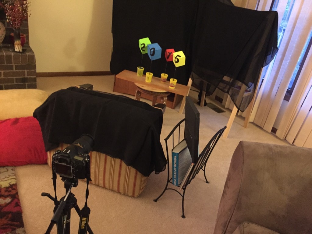
The idea for the video came from examples such as this one on Youtube – with some creative improvisation by us. Essentially what you have here are not cubes but shells of cubes. The inner shell, the concave end (imagine the inner corner of a room) has the numbers 2, 0, 1 and 4 written on them while the other side, the convex side, has the numbers 2, 0, 1 and 5 written on them. The letters were projected onto the cubes (using a computer and a projector) and written in such a way that they would be readable only when seen from ONE specific viewpoint. These “cubes” were then stuck onto wooden barbecue skewers that were held up by poking them into little boxes of playdoh. All four of these were then placed on a wooden board placed on a standard Lazy Susan (nabbed from the kitchen) which allowed them to be rotated at will. All this was placed in front of our living-room TV (covered with black sheets). After some experimentation with the lighting we had our final setup.
When seen with one eye (or through a camera), even the inside of a cube looks like a cube (due to the lack of depth perception). What this meant is that when you see the “cubes” for the first time you are not actually seeing cubes but rather the concave shell of a cube. Our eyes however, see a cube and when tilted or rotated slightly they appear to move in strange counter-intuitive ways. A full rotation leads you to seeing the convex end (with the numbers 2015). The setup was filmed using a Nikon D7000 camera and edited on iMovie. Music was provided by the amazing collection of free music provided by Kevin McLeod (at Incompetech.com). Below is a photo of the setup


Brilliant!