I have over the years, for no particular reason, created many silly, fun, (dare I say creative) representations for the TPACK framework. I realized that they had been floating around here and there and deserved to be kept in one place somewhere. It is not like the world was clamoring for them but here they are…
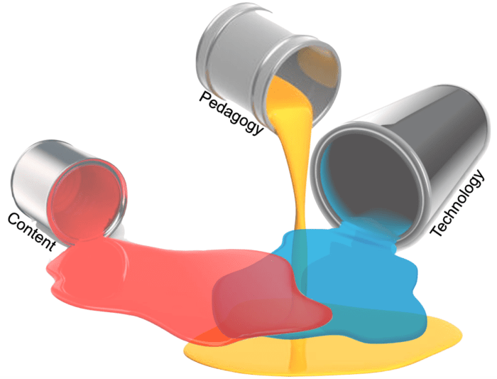
Spilled paint version
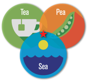
Tea-Pea-Sea Knowledge 🙂
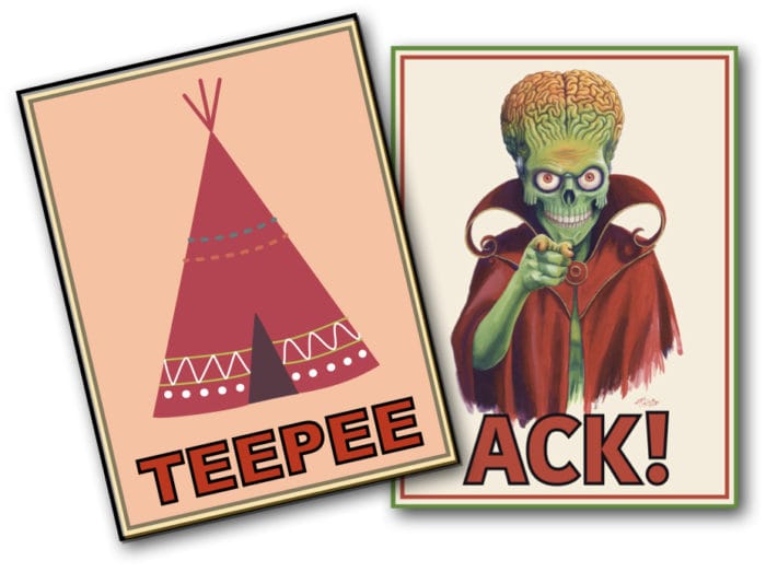
TeePee Ack! (the image says it all)
Technology, Pedagogy and Content coming together to create a rich, tasty concoction!
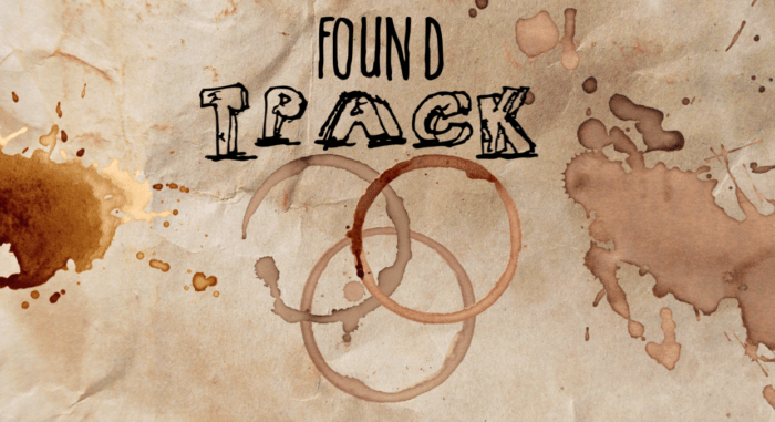
A completely created image – using coffee stains and handwritten fonts (I wish I had actually found this)
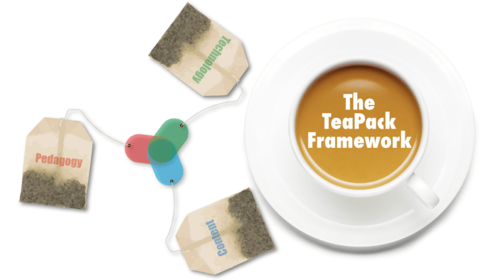
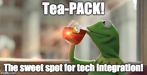
Who doesn’t like tea-pack?
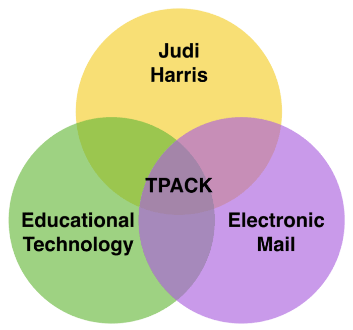
Image created as a banner for TPACK newsletters, where TPACK emerges at the intersection of Judi Harris (editor of the newsletter), email and ed tech.
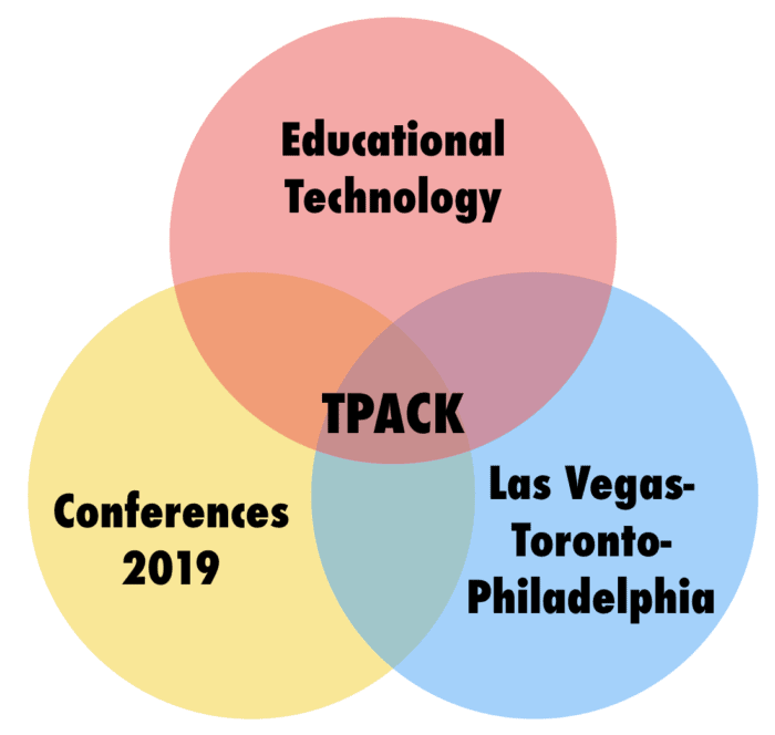
Banner image created for a special issue of the TPACK newsletter that focused on TPACK presentations in three different conferences.
Just a minimal TPACK typographical design
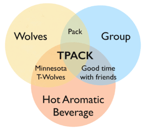
TPACK as lying at the intersection of Wolves, Groups and Hot aromatic beverages!
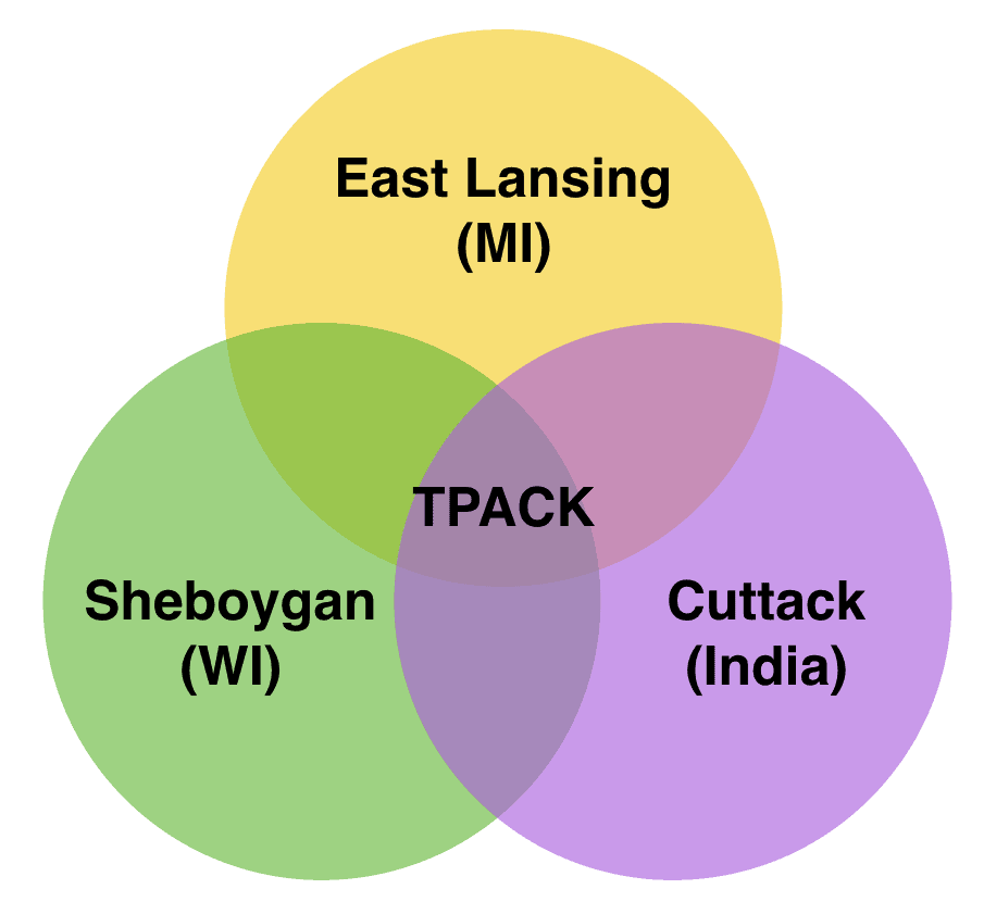
This needs some explanation. I was born in Cuttack (India), Matt Koehler in Sheboygan (WI, USA) and we met and TPACK was born in East Lansing (MI, USA).
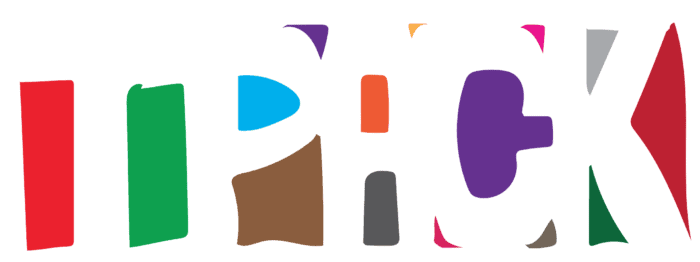
A figure-ground visual design
This is a cool design: A 3-dimensional shape that gives 3 different shadows (the letter C, P, & T) depending on how you shine light on it. In some ways that shape in the middle is this construct called TPACK!
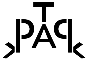
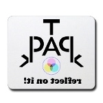
A mirror-ambigram for TPACK
Same design as above now repurposed for a t-shirt. The tag line “reflect on it” is written as if reflected in a mirror.
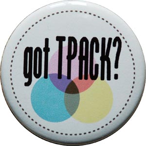
TPACK button. The design of this button has played an important role in the development of the framework itself.
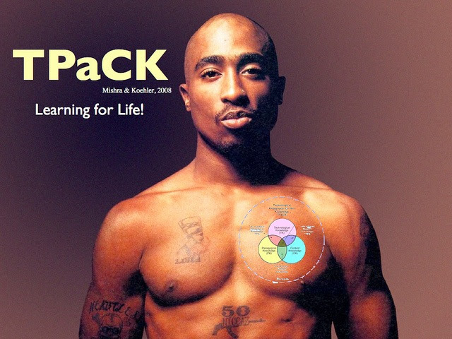
A few that I have come across in other contexts (i.e. not created by me).
Found on the Interwebs – source unknown. I have no words to describe this 🙂