Good teaching is good design

by | Tuesday, July 05, 2016

I just came across Dieter Rams: ten principles for good design and was immediately struck by how closely they paralleled what is essential for good teaching. All one has to do is replace the word “design” with “teaching” and I think we get 10 pretty good principles to follow (or think about). This is a game I have played before in this post about the need for new educational research paradigms / approaches building on some comments by Don Norman about the need to new design research paradigms / approaches (see Rethinking Ed Tech Research).

Here are Rams’ 10 principles with the word design replaced by teaching (and in a couple of cases lightly edited to make sense in this new context).

  1. Good teaching is innovative
  2. Good teaching is useful
  3. Good teaching is aesthetic
  4. Good teaching is understandable
  5. Good teaching is unobtrusive
  6. Good teaching is honest
  7. Good teaching is long-lasting
  8. Good teaching is thorough down to the last detail
  9. Good teaching is environmentally friendly
  10. Good teaching is as little teaching as possible.

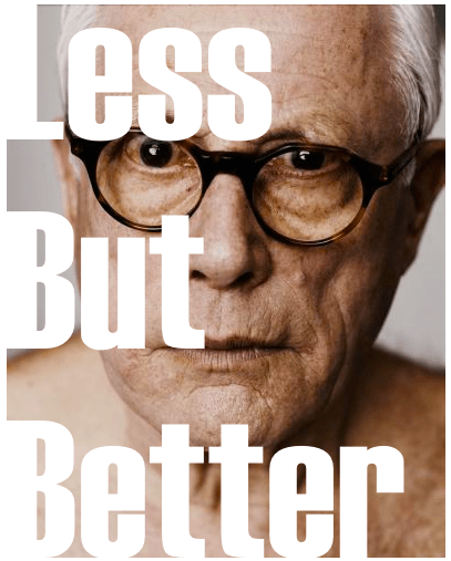
He is also known for saying “Less but better” which, if you ask me, is a good slogan for teaching as well.

A few randomly selected blog posts…

Pogue on design

David Pogue has couple of great examples in his latest posting about bad design in the world of software. Check out: It’s the Software, Not You. Potentially useful in CEP817/917...

Money for nothing, and your clicks for free!

I knew that website developers would go to great lengths to rise in Google rankings. What I didn't know was just how far people were willing to go, till I received this email. Note: I have deleted all the links and names, since that would be giving free publicity to...

Technology & Education: A provocation

Technology & Education: A provocation

Jill Castek, at the University of Arizona, invited me to participate in an NSF funded workshop on developing "Principles for the equitable design of STEM learning environments." The event was being held at Bioshpere 2, which is this awesome place near Tucson. Because,...

Douglas Adams, technologies & anticipatory plagiarism

Image Credit Leeks As readers of the blog know, Matt Koehler and I work together quite a lot. In fact we just rotate author-order in our papers since it is hard to keep track of individual contributions. (I would like to claim that the cool ideas are mine - but again...

Visualizing feeds

Sean Nash of Nashworld (recognizing a fellow data visualization junkie in me) had sent me this link a while ago ... but I just got around to it today. Check out FeedVis. So what does FeedVis do - think of it as a tag-cloud generator on steroids. Lots of fun there -...

The incredible drowning man (returns)

It's good to be back at Twente, meeting old friends and making some new ones. I had a pretty light day yesterday, which was good because I had gone around 30 hours without any sleep. After checking into the hotel and getting a short but much needed nap, I took a walk...

Visual thinking

While researching my previous post about véjà du and Abraham Wald I came across "The Back of the Napkin Blog" (a.k.a. Digital Roam). This blog is devoted to visual thinking and representation. Very cool and very interesting... well worth a visit. Turns out that there...

Representing the election

How does one best represent all the voting information that we now collect as a part of the electoral process? Here are a few websites that really stood out for me. Send me any more that you have and I can add them to the list. The first is a series of cartograms...

0 Comments

Submit a Comment

Your email address will not be published. Required fields are marked *