
A rumination on goofy sketches, the perils of reproduction as it plays out in a children’s game, a B-list Hollywood movie, and botany textbooks I read when in high school, all leading up to some thoughts on the history of scientific illustration. If this sounds even barely interesting read on…
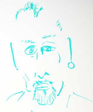
There has been a fun ongoing project going on in the fifth floor that seemed to have gotten out of hand. As anybody who has been in a meeting with me knows, I love to doodle (even while paying full attention to what is going on, I hasten to add). These sketches are typically done on scraps of paper that get tossed out at the end of the meeting. Then I decided that some of these needed to be saved for posterity. So I took over a bulletin board in our bay and started pinning up my sketches. In the meanwhile I had also started playing with my pressure sensitive graphics tablet (see some examples here and here) which ended up on the bulletin board as well.
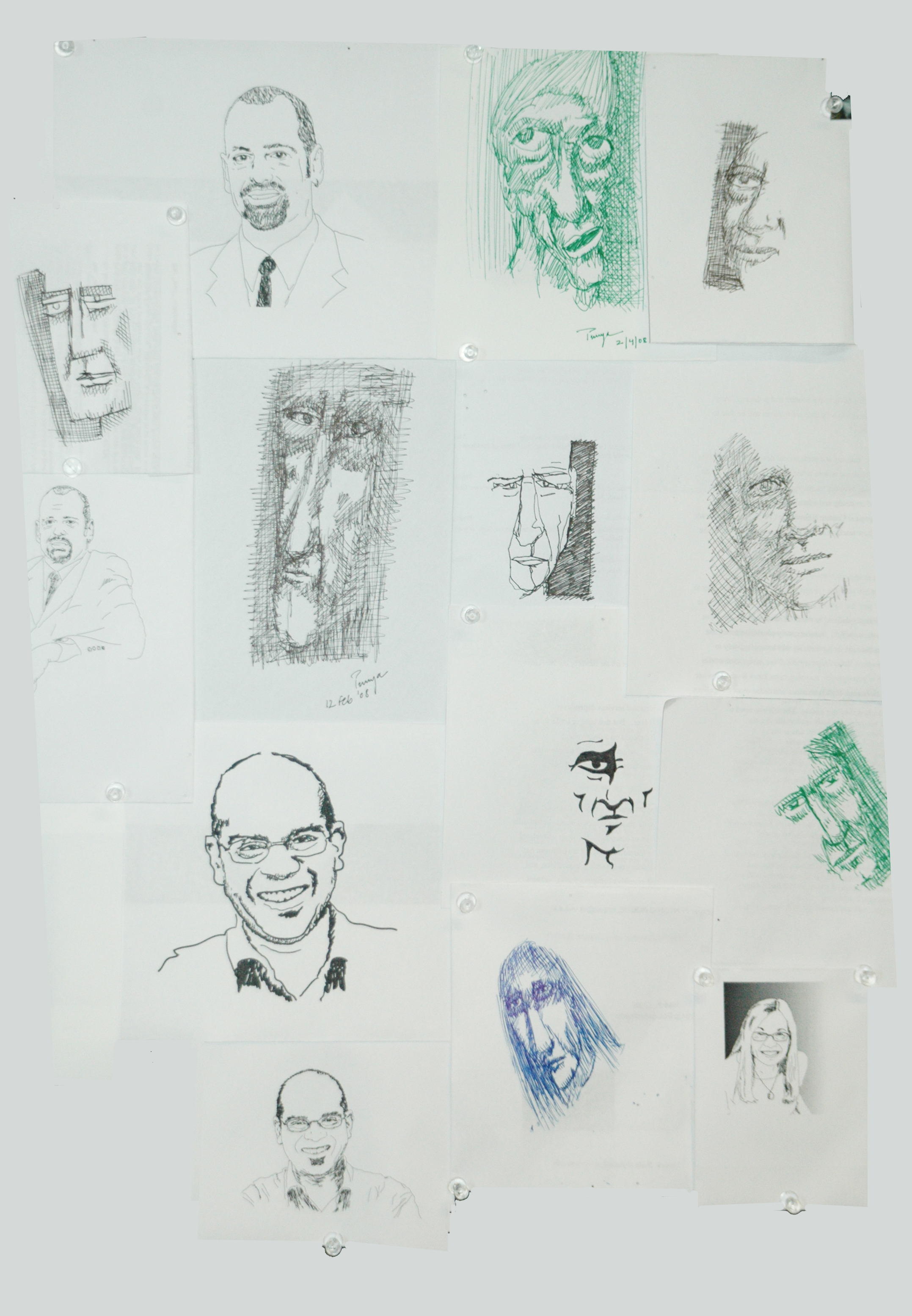
The sketch wall [Click on the image to see a larger version]

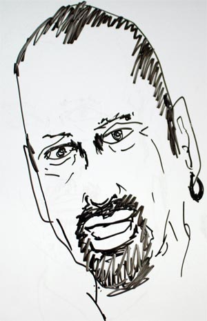
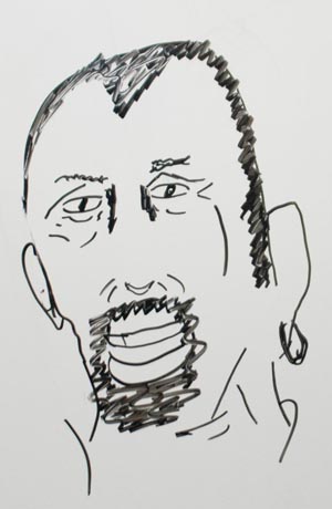
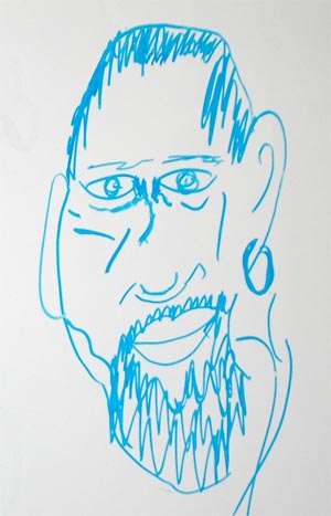
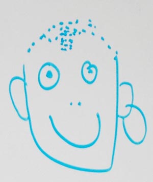
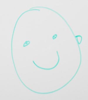
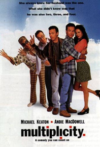 This is also similar to an idea in the movie Multiplicity where the main character manages to clone himself (and the clones make further clones of themselves). As it turns out each “new generation” is a little degraded, akin to a photocopy of a photocopy, till the final version (generation 3 or 4, I forget which) is this almost moronic character.
Now, this is all good fun (at Matt’s expense of course, and thankfully he has been quite sweet about it) but this sequence of events led me in some interesting directions that I think would be fun to point out.
The first thing this sequence of pictures reminded me of something I had noticed when I was a student in high school. My mother had given me a classic Indian botany textbook by A. C. Dutta, called “The Class Book of Botany.” [Turns out this book is still in print, 17th edition published in 2000.] This is an amazing book, detailed and yet readable by a high-schooler. The best parts of this book are the black and white, line-art illustrations. These illustrations were created specially for the book and they are detailed and beautiful. [Sadly I have no examples to include here.]
I noticed one day that the textbook we had in school, one of the generic textbooks that Indian schools use, had illustrations that had an almost uncanny resemblance to the illustrations in Dutta’s book. This led me to compare these illustrations more closely, and I found that though the illustrations for my class text book had been created anew, they both matched and did not match the originals, in interesting ways. In each case the illustrations in my school text book were copies of the ones in Dutta’s original text, and yet in some ways were worse — degraded as it were in the copying process.
Seeing the manner in which Matt’s image has been degraded reminded me of this phenomenon (of degradation) I had noticed so many years ago.
 Many years later, during my stint at the University of Illinois as a graduate student, I started working on a paper on scientific illustration. [Whether my interest in scientific illustration was prompted in some way by my experience as a high-school student noticing how mutated through the process of copying, I don’t know.] This paper was published (and re-published) and has been quite widely cited (especially for a paper that was somewhat outside my area of expertise). It was during my research for this paper that I was introduced Brian Ford’s masterful book, Images of Science: A History of Scientific Illustration. This is a great book, and I quote from its description:
In this superbly illustrated survey, Brian Ford unravels many strands in the development of scientific knowledge over the centuries, showing how the study of illustration provides a retrospective view of the conduct of research. The accuracy of illustrations from certain periods can be seen to reflect the contemporary status of a particular science, while in some cases identical images have recurred over the centuries. Comparison of derivative works with their predecessors is highly instructive, reveal a ‘family tree’ of images descended from a single original. By retracing some of these patterns, the author shows how discoveries have been incorporated into the body of knowledge and, equally important, how errors have been perpetuated and misinformation compounded
As the last couple of sentences in the description indicate, Ford devotes quite a few pages in the book (with lots of examples) to the manner in which images have been copied and re-copied over the years. For instance he writes that “plagiarism has been rife in science since the discipline emerged…” Most interestingly, and relevant to this post, is that, “each generation of copying takes one further from reality. A living specimen, well portrayed, becomes wooden and stiff as it is copied and re-copied. Scientific realities mutate: six-pointed snowflakes become eight-pointed, [something that just does not exist in nature] just as carefully delineated bacteria transpose themselves into species that seem to exist only in textbooks…there are ‘icons’ that stand out in scientific literature: illustrations to attract respect for learning, but which cannot be intended to represent reality. Scientific illustration may be scientific in nature, but it may be far from scientific in application (p. 164).”
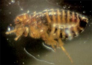
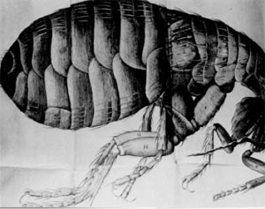
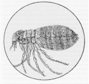
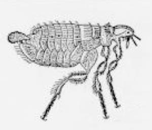
Here are some examples from his book. The first image is an actual photograph of a flea as seen through a primitive microscope (the kind used by Robert Hooke). The next image is an illustration made by Hooke, based on what he saw. The level of detail in the drawing is staggering, particularly considering we now know what he really saw, an interesting fact in and of itself. The next two sketches below show diagrams plagiarized from Hooke’s original drawing. These examples were created by people who did not take the trouble of looking through a microscope, but rather chose the easy route of copying Hooke’s original illustration (or better still, copying copies of the copies). This is similar to what I had noticed in my biology textbooks as a child and is a great example of the manner in which a “living specimen” becomes “wooden and stiff as it is copied and re-copied.”
Douglas Hofstadter talks of micro-domains that capture the richness of a phenomena (akin go Spiro’s idea of bite-sized-chunks of complexity) and similar to the mini-design (Apollo 13 tasks) that Matt and I have used in our design courses. In some funny kind of way, the degradation of Matt, as we copied and recopied his picture, captures in a micro-context the troubles with the whole history of scientific representation.
Note: The paper on scientific illustration I mention above can be found here:
Mishra, P. (1999/2004). The role of abstraction in scientific illustration: Implications for pedagogy. Journal of Visual Literacy. 19(2), 139-158. Reprinted in C. Handa (Ed.). Visual rhetoric in a digital world: A critical sourcebook. (pp. 177-194). Boston, MA: Bedford/St. Martin’s Press.
A description of the micro-design projects (called Apollo 13 projects) can be found in
Mishra, P. & Koehler, M. J. (in press). Taking a byte out of design: Fostering design thinking on the first day of class. Teachers College Record.
For some comic relief or to add some of your own, jump on over to WeedStories. It’s a big collection of people’s first time and other funny situations involving marijuana. If you like FMyLife, you’ll like WeedStories, just don’t forget to submit your own story!
As Edgar Allen Poe put it, “Is all we see or seem,
but a dream within a dream.”
Reminds me of the study that was done on a professor who was given a dose of LSD and was asked to draw a picture. After several hours the picture was degraded and distorted.