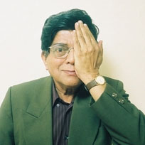
R. K. Joshi was a calligrapher, typographer, artist, type-designer, and teacher. He has been maybe the greatest influence on me and what I do as a designer and teacher. And I know I am not alone. He influenced a generation or more of designers in India and elsewhere.
I got to know RK (as he was known) when I was a student at the Industrial Design Center, at IIT Mumbai. I came to IDC with an interest in educational cinema with little knowledge and even less interest in typography. In fact, during the admissions interview, RK asking me to identify a typeface I had used in a poster, and I failed to do so. You can gauge the level of my ignorance by the fact that that type I could not name was Helvetica! One class with RK changed all that. Type came alive in his hands, and his passion was infectious. It wasn’t that I knew much more at the end of the semester, but now I knew what I didn’t know. And what a wonderful world I had been missing out on. RK taught me to love typefaces, their bowls and curves, quirks and instabilities, individual characteristics and personalities, their rules and their inherent lawlessness. He taught me how media influence meaning, how Indian scripts, meant to be scratched into palm-leaves, were destroyed by the standard typewriter, and then came back to life in the digital world. This passion with type, their shapes and meanings, stays with me to this day.

And then there was RK’s voice! Who can forget that voice? The deep rumble, the almost frustrating deliberate slow pace that forced you to hang on to every word. And of course the stammer. I remember being somewhat embarrassed by the first time I heard it, this strange feeling one gets when faced with someone’s disability. But I was wrong. This wasn’t a disability. Over time, I came to this strange realization that this stammer or stutter would appear at critical moments, particularly when he needed to emphasize something. This was part of his rhetorical arsenal, his verbal ellipsis, … as it were. And when that happened, you would lean forward in your chair, waiting for the sound, the word to appear, and you gave him your undivided attention. And he did this not by raising his voice but rather dropping it down to a whisper, and through pauses.
This deliberate approach, this weighing of alternatives before rushing in with the next word, or brushstroke (an act that even as it creates something, destroys other possibilities) was RK’s philosophy to the core. Rugweed Deshpande, another of his students, recently posted to the IDC list, something RK had once said, in Marathi, “Ek akshar lihava, ek tap thambava,” which loosely translates as “write one letter and wait for ages.” I can hear RK’s voice, with these pregnant pauses, even as I read this quote.
From RK, I learned the value of silence, of white space – of how emptiness can often speak louder than any noise (audio or visual) we can make. And how, design is a deliberate, purposeful act of meaning making, where the meaning comes as much from the things we create but from the spaces and silences between and within them.

And RK loved to play. Seriously. He cared deeply about his work (and that of his students) but combined that with an impish sense of humor. There was an element of Dada in his work and his love of the concrete poetry. I remember our first class meeting. All of us new students sitting around a table with RK, and as is typical, we were asked to introduce ourselves to each other. But there was a constraint, we had to do this in exactly 60 seconds. RK was the first to go. He pulled off his watch, set the timer and began speaking. There was that stammer, the thoughtful selection of each word as he described is beginning work as a advertising designer, and his growing interest in typefaces and types, his research into ancient scripts, and calligraphy. All of a sudden, in mid sentence, his voice completely vanished, but his lips kept moving, as if he were still speaking but no sound emerged. After he was done, he paused for a while and told us that the reason he had stopped making any sound was because his 60 seconds were up. However, he continued, it would be unfair to not complete the thought he had been in the middle of articulating, so he just went on speaking, albeit silently.
There was an element of a child in him, irrepressible and infectious. It was ok, he showed us, to play and goof around, because sometimes that is the only way to get at a deeper meaning, or at the very least, to have a good time. For me, coming from the stultified world of engineering, this was a breath of fresh air, an acknowledgement of vague yearnings and desires that I had felt, but never had a chance to articulate, in any coherent manner.

And finally, RK was a great teacher. He demonstrated it in the depth of his knowledge of type and type design – be it hand written scripts or computer designed fonts. He was a great teacher because he was passionate about what he did – a passion he demonstrated in his design work and in his teaching. He demonstrated it in critiques always thoughtful and sometimes harsh. But most of all he demonstrated it in his way of living. I remember, one morning, our class was preparing for a presentation. We had all worked extremely hard, through the night preparing for this and were busy pinning up our work when RK walked in. In his typical way, he walked around, taking his glasses off, peering at our work, closely and thoughtfully. And then he stopped at someone’s work and looked at it closely and then stepping back, from far. RK then stepped up to the piece, and unpinned it from the wall, looked around the class for a straight edge. He pulled out his wallet and from it took out a small packet and carefully un-wrapped a blade and went on to slice off a tiny sliver of paper, to get the edges to be exactly a right angle. He then pinned it up on the wall once again. Not a word was spoken.
How do I even describe what an impact this event had on me? This was one of the stories I shared at my job interview when asked what kind of a teacher I would like to be. This sense of preparedness (of having a blade at hand) and of concern for the little things (do you think any of us ever were that careless again) and, most importantly, that these things matter not because we would be evaluated but just because every little detail matters. Becoming a designer is more than just creating pretty things — it is an act of becoming. The professional and the personal are one.
In my design classes I often quote Miyake, in that “Design is not for philosophy—it’s for life.” I can think of no other person who embodies this better than RK.

RK is no longer with us but RK is not dead. He is not dead because the ripples of his existence will live on. I hadn’t been in touch with him for years (an surprise meeting at NTSC aside). Raja Mohanty and I had talked about visiting him sometime, though that never happened, and I do regret that. However, in some sense RK has always been with me. That combination of utter seriousness about expression and meaning, with a subtle but inherently whacky sense of humor, the love for typography and visual design, the bringing together of one’s professional and personal lives, this will stay with me forever. I owe him a debt that I can never repay.

Advaita by R. K. Joshi – The philosophical concept of existence rendered through a calligraphic logo of the Sanskrit word “advaita,” meaning non-dualism. A single calligraphic stroke splits into two before merging into one, represents everything beginning from the “one,” which seemingly gets distinguished as two (maya i.e. illusion). Duality, ultimately, merges into the “one.”
Here are some links to RK’s work on the web.
You can hear his voice by listening to the 5 interviews he did with TypeRadio during his visit to ATypI Lisbon 2006. The same interviews are also available at megafeed
You can see some examples of his work here
Some photographs from the ATypI 2002 1, 2, 3, 4.,
The description of RK’s presentation a the 2002 ATypI meeting is as follows:
an award-winning Indian typographer and type teacher. His presentation was spiritual and magical, interweaving movement, silence, sound, type composition, and Indian poetry. The audience was in awe and surrounded the speaker after the talk for a full fifteen minutes.
The photo on the top of this page is taken (and edited from) the photo here.


I would like to see his work. But unfortunately none of the links are working. Could you please look into this?
Sorry that’s the nature of the web – links rot and die. Thankfully his interviews that I link to are still online.
i would want r. k. joshi’s ‘satyam shivam sundaram’. can anybody help me ?
somewhere in mid 80’s india today carried an article r. k. joshi. that article had a calligraphy of ‘satyam shivam sundram’ can u pls find it for me at vijay26bn@rediffmail.com
Couldn´t be written any better. Reading that post reminds me of my old room mate! He frequently kept talking about this. I can forward this article to him. Very certain he can possess a very good read. Thanks for sharing!
dear,
Sir.m big fan of calligraphy,my passion is calligraphy.
& aslo won many prizes for it aslo.but thing is tht i write my own one..
would u help me with futher scope for it..
m now in 3rd yrs bcom student..in pune
9960642255.
regards,
KUSH
Hello I am Zahra Musavi , an Iranian art researcher . And find your site by searching in Google . I have found a book (Shahnameh Ferdosi) in a museum in Iran-Ray near Tehran that is written in Farsi and painted and is signed the name of calligrapher -nastaligh style – is MOHAMAD KAMAL GHANUN GU , from india .I have search for finding more information about him but have not yet find any things date of writing this book is 1260 h it means 19 cent -now I now want to ask you that would you please help me to find more about him?
Or show me a site or book to finding about him and his life
Thanks you a lot
Dear Punya,
You conveyed all the feelings through your article. About RK’s calligraphy, typography, his voice like a thunder, his childlike nature etc. Thanks for this.
RK is great. It is difficult to digest that we won’t be able to meet him. However, he is there with us always in the form of letters, alphabets, calligraphy and beautiful types around us.
Even though a PD student, I used worked with RK for on a few Typo projects. He even took me to various colleges in Maharashtra for the calligraphy workshops.
I have plenty of his memories. Recently I met him in Typography/Calligraphy workshop held in Pune by CDAC. That time also he was as charming as he was in IDC 14 years back. I was amazed to see this.
Did not know that it was the last meeting.
Thanks again for your article.
– Prasanna Halbe PD 1992-1994
Thanks Gaurav. I appreciate your kind words.
This probably is the first time I am adding comments for a published writing… couldn’t resist myself. I know RK sir only through few of the workshops I underwent during my time in IDC (1999-2001 batch). I remember how I was humbled by the honor he gave me to put his slides on OHP.
My sincere thanks to you for deliberating on otherwise insignificant attributes for which he was famous. I thought I knew him very well, but now I know of my ignorance…
Thanks for such a beautiful piece of work…